
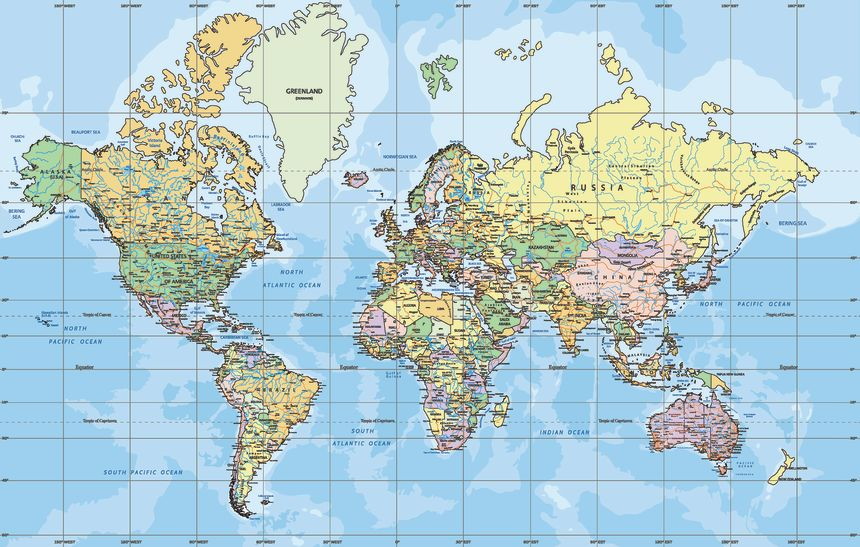
The United Nations has backed a move to promote a different world map projection, reviving a centuries-old argument over how accurately a flat map can represent a spherical Earth.
The UN General Assembly voted 164-1 on September 4 to adopt a resolution encouraging the use of the Equal Earth projection, which presents countries and continents with a more accurate representation of their relative areas.
The United States was the only country to vote against the resolution, according to the supplied report.
The move has put the spotlight back on Gerardus Mercator, the 16th-century cartographer whose famous projection transformed maritime navigation but also made parts of the world appear dramatically larger or smaller than they really are.
Why is the UN moving away from the Mercator projection?
The Mercator projection was designed for navigation, not for accurately comparing the size of continents.
When the curved surface of Earth is transferred onto a flat map, some form of distortion is unavoidable. Mercator’s solution preserved local angles and directions, making it exceptionally useful for sailors, but it also caused areas near the poles to appear increasingly large.
That means countries in northern regions can look enormous compared with countries closer to the Equator.
The proposed shift toward Equal Earth reflects a different priority: showing the world’s land areas in their correct proportions rather than optimizing the map for navigation.
What is the Mercator projection?
Gerardus Mercator introduced his world map in 1569.
Born Geert de Kremer in 1512 in what is now Belgium, Mercator became one of Europe’s most influential cartographers. His projection transformed the spherical Earth into a flat grid in which lines of latitude and longitude intersect at right angles.
Its most important feature for sailors was the way it represented constant compass bearings as straight lines.
A ship following a fixed compass direction could plot that course as a straight line on a Mercator chart, making long-distance navigation much easier.
Why does the Mercator map make Africa look smaller?
The problem comes from what happens as the map moves away from the Equator.
To preserve angles and maintain the projection’s navigational properties, Mercator progressively stretches the map toward the North and South Poles.
The distortion becomes extreme at very high latitudes.
Africa, which straddles the Equator and extends into the tropics, is therefore visually reduced relative to regions such as Greenland, northern Europe and Russia.
One of the most famous examples is Greenland. On a typical Mercator map, Greenland can appear comparable in size to Africa.
In reality, Africa covers roughly 30.4 million square kilometers, while Greenland is about 2.2 million square kilometers. Africa is therefore about 14 times larger.
Does Mercator actually ‘shrink’ Africa?
Technically, the projection does not change Africa’s physical size. It changes how that size is represented on a flat surface.
This distinction matters.
Mercator is not a “wrong” map. It is a map optimized for a particular purpose. Its distortion is a mathematical consequence of preserving angles and navigational bearings.
The controversy arises when a projection designed for navigation is used as a general-purpose image of the world.
That can influence people’s visual perception of the relative importance or scale of different regions even though the distortion has a mathematical explanation.
What is the Equal Earth projection?
Equal Earth was developed to preserve the relative areas of continents and countries more accurately.
The projection was created in 2018 by cartographers Bojan Šavrič, Bernhard Jenny and Tom Patterson.
Unlike Mercator, Equal Earth is an equal-area projection. This means that the area of a region on the map is proportional to its actual area on Earth.
Its shape is deliberately curved and less familiar than a traditional rectangular world map, but it provides a much better visual comparison of landmass sizes.
Africa consequently occupies the enormous share of the global map that its real-world area warrants.
Why can’t one world map be completely accurate?
Because Earth is three-dimensional and a map is usually two-dimensional.
Imagine trying to flatten an orange peel without tearing, stretching or folding it. You can preserve some properties, such as angles, distances, shapes or areas, but not all of them simultaneously.
Different map projections therefore make different trade-offs.
Mercator prioritizes angles and navigation. Equal-area projections prioritize accurate relative size. Other projections are designed to balance distortion across several characteristics.
There is no single flat world map that perfectly preserves every property of the globe.
Why was Mercator so important to sailors?
Mercator’s greatest achievement was solving a practical navigation problem.
On a globe, a ship traveling along a constant compass bearing follows a curved path called a rhumb line. On a Mercator chart, that same route can be drawn as a straight line.
That made it much easier for navigators to plot and maintain courses during long ocean voyages.
For sailors during the Age of Discovery, this was enormously useful. A map that looked visually distorted could nonetheless be an excellent navigational instrument.
That is why the Mercator projection remained influential long after its introduction.
Is the Mercator projection still used today?
Yes.
Despite the UN’s reported push toward Equal Earth for more accurate general maps, Mercator has not simply disappeared.
Its variants remain important in navigation and digital mapping. The Web Mercator projection, in particular, became a standard for online maps because it works efficiently with tiled digital maps and provides convenient visual behavior at local scales.
So the UN move should not be interpreted as meaning that ships or mapping systems around the world will suddenly stop using Mercator.
The issue is primarily about what projection should be used when presenting the entire world and comparing the size of different regions.
Why does Africa’s representation matter?
Africa is the world’s second-largest continent by area, covering about one-fifth of Earth’s total land surface.
Yet in Mercator-based maps, its visual size can appear substantially smaller relative to Europe, North America and northern Asia than it actually is.
That distortion can have an educational consequence.
People often encounter the world first through school atlases, wall maps and digital interfaces. A map that repeatedly exaggerates some regions while reducing others can shape intuitive assumptions about geography.
That is one reason advocates of equal-area projections argue that map design is not merely a technical question.
What does the UN resolution actually change?
The resolution does not mean that the Mercator projection has been legally banned worldwide.
It is better understood as an endorsement of a different approach to representing the planet, particularly in educational and public contexts.
The goal is to encourage maps that convey the relative size of Earth’s regions more accurately and address what supporters describe as long-standing geographic misrepresentation.
Implementation will ultimately depend on individual governments, institutions, schools, publishers and mapping services.
Who was Gerardus Mercator?
Mercator was much more than the creator of one famous projection.
He produced globes, maps and mathematical instruments and helped establish a more systematic approach to cartography during the Renaissance.
He is also credited with popularizing the term “atlas” for a collection of maps. The word is now a universal part of the language of geography.
His work influenced navigation and European understanding of the world for centuries.
In that sense, Mercator’s legacy is not being erased by the emergence of Equal Earth. The two projections simply serve different purposes.
Why the word ‘atlas’ is linked to Mercator
Mercator is widely credited with being the first cartographer to use “atlas” for a bound collection of maps.
He used the title “Atlas” for a major collection of geographic works published around the end of his life.
The name was inspired by the mythological figure Atlas, who was traditionally depicted carrying the heavens.
The term eventually became the standard word for a book of maps.
Why this debate is bigger than a map
At first glance, changing a world map can seem like a dry cartography issue.
But maps influence how people perceive space, scale and geography. A projection can make some countries look enormous and others surprisingly small even when the physical difference is the reverse.
The UN’s decision therefore touches on a deeper question: should a map used to teach the world prioritize navigational convenience or geographic accuracy?
Mercator won that argument centuries ago because sailors needed a practical tool.
Equal Earth is now being promoted for a different reason: to show the world closer to the proportions it actually has.
The planet itself has not changed. The lens through which humanity looks at it has.