
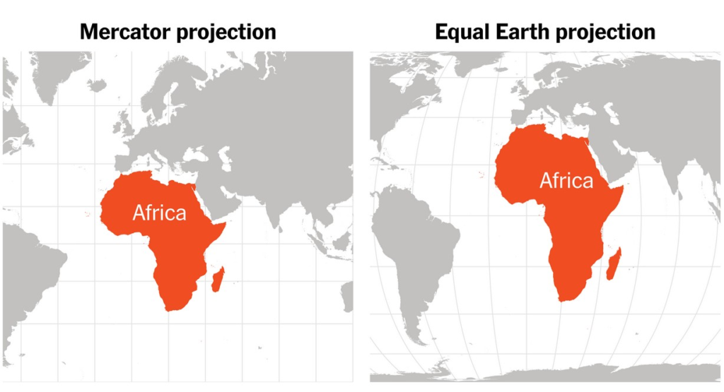
Look at a conventional world maps and Greenland can appear almost as large as Africa. In reality, Africa is vastly bigger. The continent covers about 30.4 million square kilometers, while Greenland covers roughly 2.2 million square kilometers. Africa is therefore about 14 times larger.
So why does a map make them look so similar?
The answer lies in a mathematical problem that cartographers have wrestled with for centuries: how do you take a spherical Earth and display it on a flat sheet of paper without distorting anything?
Why can’t flat world maps show Earth perfectly?
There is no mathematically perfect way to flatten a globe.
Earth is three-dimensional, while a conventional map is two-dimensional. Converting one into the other inevitably produces distortion in at least one characteristic, such as area, shape, distance or direction.
Different map projections make different compromises.
The Mercator projection, introduced by Flemish cartographer Gerardus Mercator in 1569, prioritized preserving local angles and directions. That made it extraordinarily useful for maritime navigation, even though it dramatically distorted the apparent size of landmasses toward the poles.
The Equal Earth projection takes the opposite approach in one important respect. It preserves relative area, allowing continents to appear much closer to their actual sizes.
What did Gerardus Mercator actually invent?
Mercator was a 16th-century cartographer, engraver and mathematician whose work transformed navigation.
His 1569 world map used what became known as the Mercator projection. The system represented lines of latitude and longitude as a rectangular grid, with the spacing between them increasing toward the poles.
This allowed a line representing a constant compass bearing to appear as a straight line on the map, a major practical advantage for sailors.
For ships crossing oceans, that was far more important than making Greenland look appropriately small.
Mercator was therefore not trying to produce a map for comparing the size of continents. He was solving a navigation problem.
Why does the Mercator projection distort Africa?
The distortion becomes stronger as you move away from the Equator.
To preserve angles and maintain the projection’s navigational properties, the map stretches areas increasingly as they approach the North and South Poles.
Africa lies largely in tropical and equatorial latitudes, so it experiences much less stretching than northern regions.
Greenland, Canada and northern Russia sit much farther from the Equator. Their areas are therefore greatly enlarged on a standard Mercator map.
The result can be visually startling. Greenland may appear comparable to Africa even though the African continent is many times larger.
Is Mercator responsible for making Africa look ‘small’?
Visually, yes. Intentionally, no evidence establishes that.
This is an important distinction because the Mercator projection is sometimes described as if it were deliberately designed to make Africa or other equatorial regions less important.
The mathematics tells a different story.
The projection was created for navigation, and its distortion is a consequence of that design. It does not change the physical size of Africa. It changes the amount of map space used to represent different parts of the globe.
The political debate comes later, from the way people may interpret that visual distortion.
Why has distorted maps become a political issue?
Maps do more than tell us where countries are. They also shape people’s intuitive sense of scale.
A child repeatedly seeing Europe, Russia or Greenland displayed much larger than their actual areas may develop a different mental picture of the world than someone using an equal-area map.
That has led scholars and activists to argue that cartography can influence perceptions of geography and power.
The debate is closely tied to the history of European exploration and colonialism because many globally influential maps were developed during periods when European powers dominated international trade, navigation and political institutions.
That does not mean every use of the Mercator projection was a political statement. It does mean that the maps people inherit can carry historical assumptions with them.
How much bigger is Africa than Greenland?
The difference is enormous.
Africa has an area of about 30.4 million square kilometers.
Greenland covers approximately 2.2 million square kilometers.
That makes Africa close to 14 times larger.
Put another way, Greenland could fit inside Africa many times over. The visual similarity between the two on a Mercator map is therefore a textbook example of projection distortion.
Could Africa fit several major countries inside it?
Yes, and that comparison helps make the scale easier to understand.
Africa is so large that its land area exceeds the combined areas of countries including the United States, China, India and Japan, with additional space remaining.
Maps that preserve area make this easier to appreciate immediately because Africa occupies the enormous portion of the globe that its real size warrants.
The point is not that Africa is “bigger than countries” in some geopolitical sense. It is a geographic observation about land area, and it is precisely the kind of comparison that distorted world maps can obscure.
What is the Equal Earth projection?
Equal Earth is a modern world-map projection introduced in 2018 by cartographers Bojan Šavrič, Bernhard Jenny and Tom Patterson.
It is an equal-area projection, meaning that the relative areas of regions are preserved.
The shape is less familiar than the rectangular Mercator map, but that is partly because it is designed to solve a different problem.
Instead of asking, “How can a sailor plot a constant bearing as a straight line?” Equal Earth asks, “How can we show the relative size of continents more honestly on a flat map?”
For geography textbooks, data visualization and general world maps, that can be a valuable trade-off.
Why is the United Nations talking about changing world maps?
The UN General Assembly adopted a resolution on September 4, 2026, titled “Correct the Map: Rebalancing Global Cartographic Representation and Promoting Equitable Representation of the World’s Regions, Particularly Africa.”
The vote was 164 in favor, one against and six abstentions.
The resolution encourages greater use of cartographic approaches that represent the relative sizes of continental landmasses more accurately. It does not ban Mercator or require every map in the world to adopt Equal Earth.
That distinction is crucial.
The UN itself emphasized that the resolution does not affect national borders, sovereignty, territorial status or navigation. It also does not mandate a single projection for every purpose.
Did the UN officially choose Equal Earth?
Not in the absolute sense implied by some headlines.
The resolution discusses Equal Earth and equal-area projections, but countries clarified during the UN debate that the measure is not intended to require one specific projection for every use.
India, for example, explicitly said it supported the broader principle of encouraging equal-area projections rather than endorsing Equal Earth as the only acceptable methodology. The United States was the sole country to vote against the resolution.
So the move is better described as support for more accurate representation of relative landmass size, particularly in educational and awareness-raising settings.
Has Africa already adopted Equal Earth?
The African Union has gone further than the UN in this respect.
At its February 2026 summit, the AU adopted the Equal Earth cartographic projection and urged member states to revise educational curricula accordingly. The organization framed the initiative as part of a wider effort to address distorted representations of Africa.
That means the push to change how Africa is represented did not begin with the UN vote. The UN resolution elevated an initiative that had already gained institutional support in Africa.
Does this mean the Mercator projection will disappear?
No.
Mercator remains useful for the purpose for which it was created.
Its ability to represent constant compass bearings as straight lines still makes Mercator-based projections valuable in navigation and mapping. The UN resolution explicitly leaves navigational use outside its scope.
The real change is more likely to involve educational maps, public-facing graphics and other situations where comparing the true size of continents is more important than plotting sailing routes.
In other words, Mercator is not being sent to a cartographic retirement home.
It is simply being asked to stop pretending that a navigation chart is the only way to picture the planet.
Is the Mercator map ‘wrong’?
Not exactly.
A map can be mathematically useful while being visually distorted.
Mercator is excellent at preserving local angles and representing constant directions. Equal Earth is excellent at preserving area. Neither can preserve every property of a spherical planet on a flat surface.
The better question is not whether one projection is “right” and another is “wrong.”
It is whether the projection is appropriate for what the map is trying to communicate.
For navigation, Mercator can be extremely useful. For teaching students how large Africa actually is, an equal-area projection may be far more appropriate.
Why does Africa’s size matter beyond geography?
Because visual scale can affect understanding.
Africa contains 54 recognized sovereign states and is home to more than 1.5 billion people. It holds enormous agricultural, mineral, energy and ecological resources.
Yet distorted world maps can make the continent appear visually smaller than its actual geographic footprint.
The “Correct the Map” campaign argues that changing that representation can help challenge long-standing misconceptions about Africa’s size and significance.
Critics of the idea counter that geographic projection alone cannot explain perceptions of political or economic power. That is also fair.
A map does not determine how the world treats a continent. But it can influence how people first visualize it.
So, why does Africa not look its true size on many maps?
Because the Earth is a globe, and flat maps must choose what to preserve.
Mercator chose navigation. That decision produced a powerful and practical projection, but it also enlarged high-latitude regions and made equatorial areas such as Africa appear relatively smaller.
The emerging push toward Equal Earth is therefore not an attempt to rewrite geography.
It is an attempt to represent geography more faithfully when the goal is comparing the size of continents.
Africa has always been enormous.
The map was simply using a different set of mathematical rules.